First chart is FTSE monthly from 2006 until today.The big top to the left is 2007 record high top. From the top down to the bottom 2009 there were five waves. From 2009 to the top 2011 there were only three waves. Look at this broad top. It looks like a head with two shoulders to me. If the downtrend continues the trend will come down to the horizontal line, called the neckline. If FTSE goes below that line it will fall down to 2009 bottom again which means a 40 percent correction from now.
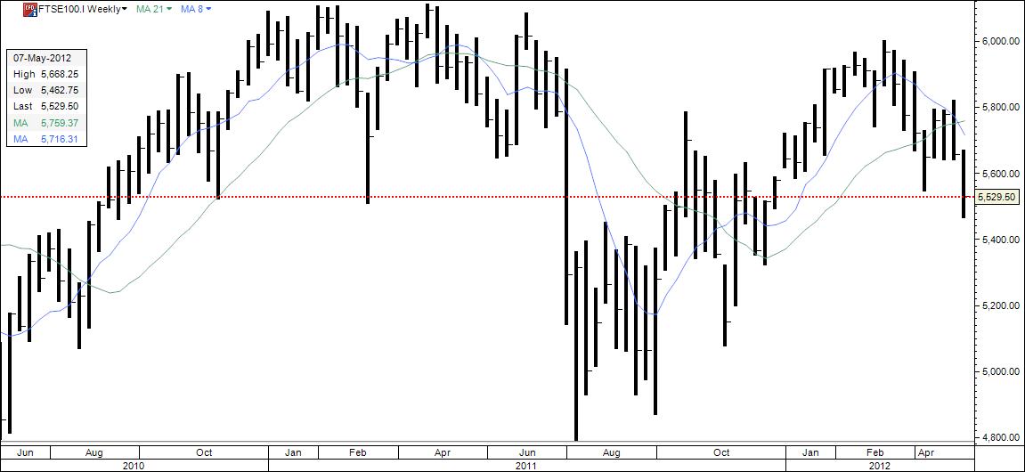
Second chart is the weekly chart, one bar is one week. See how the right shoulder is falling to a new low. It looks to me as if the down trend to the neckline has started.
The third chart is the daily chart, one bar is one day. The last bar was the close Friday. Here you see the break on downside better from the first bottom to the left. This is probably the third wave down that has started. This is what FTSE looks to me now. But I am not absolutely sure yet that it is a head and shoulder. You will know what will happen or if I change my mind in the blog.


No comments:
Post a Comment